
case study
sundae school hemp-based skincare line
(2024)
background
seeing potential for sundae school to grow beyond apparel and cannabis, I explored how the brand could extend into hemp skincare. with a strong brand rooted in playfulness, Korean heritage, and high design, the goal was to create a hemp-infused skincare line that felt both functional and sensorial. this project focused on extending their identity through culturally grounded ingredients like matcha and rice water, playful product naming, and forms that speak to beauty’s softer side of stoner culture.
scope of work
product design
packaging design
graphic design
photography

brand identity
sundae school’s brand identity blends playful rebellion with minimalist sophistication, fusing korean and western aesthetics through clean design, muted neutrals, soft pastels, and bold blacks. their tone is witty, youthful, and conversational—positioning cannabis as a lifestyle through inclusive visuals and educational, exploratory content.


concept direction
create a skincare line that combines traditional asian beauty rituals with hemp-based formulations, targeting consumers who appreciate cannabis culture and an elevated skincare experience.

minimalist and clean
cannabis or biblical reference

gender neutral appeal

playful, sophisticated, and culturally fused

exploration
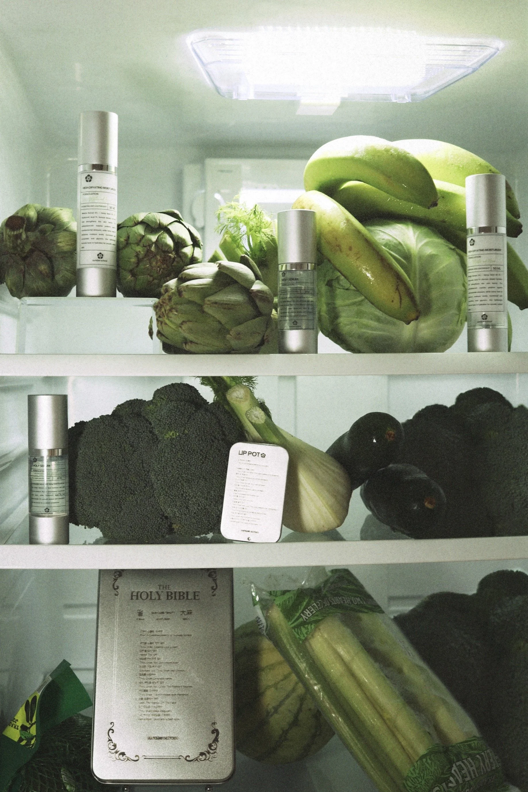
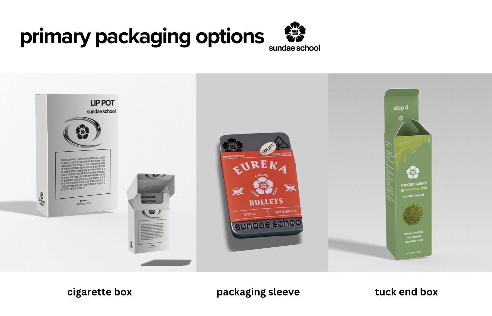
to align with sundae school’s existing design language while keeping costs low, I prototyped a lip “pot” using 3D printing and laser-engraved metal tins, inspired by their gummy packaging.
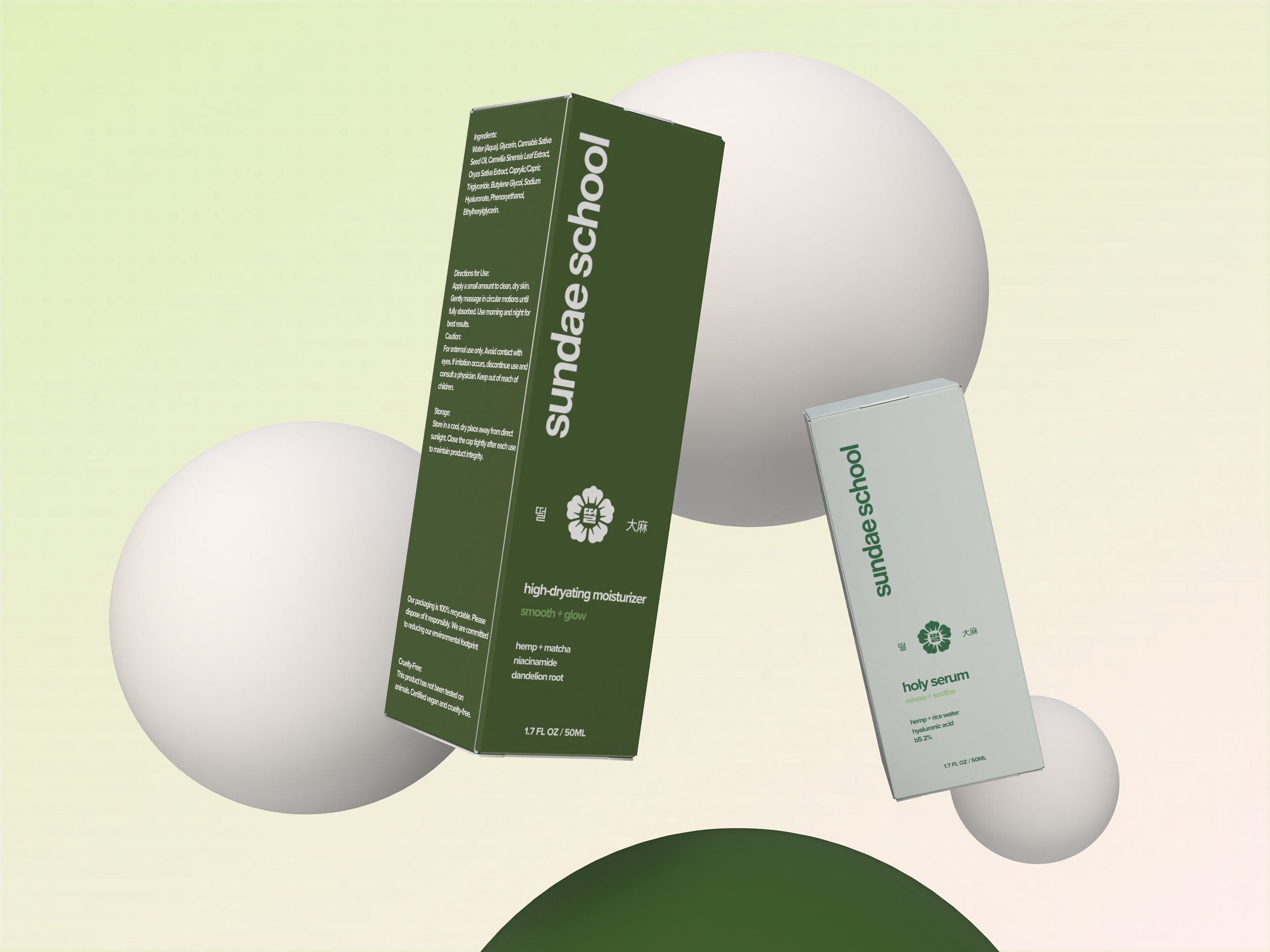
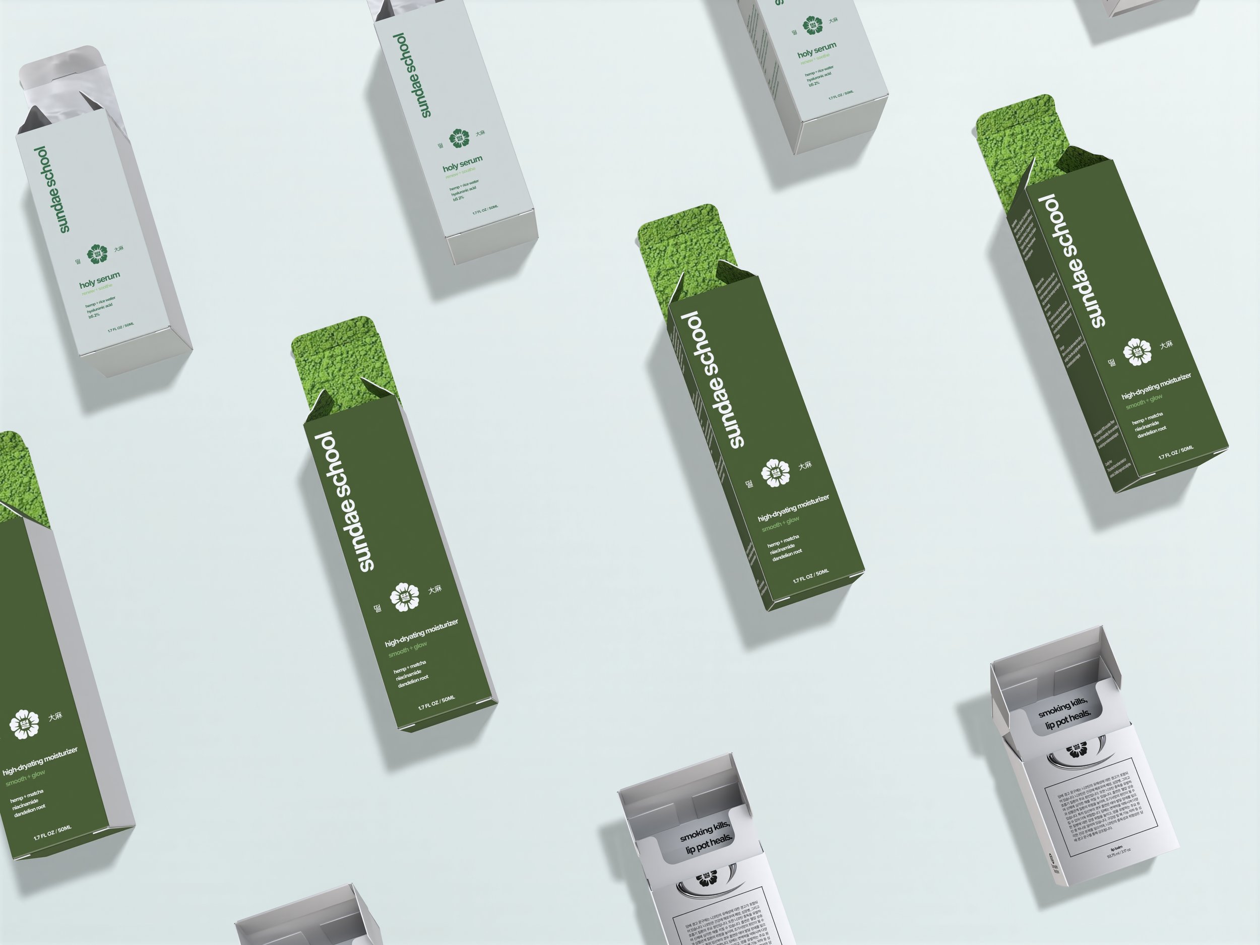
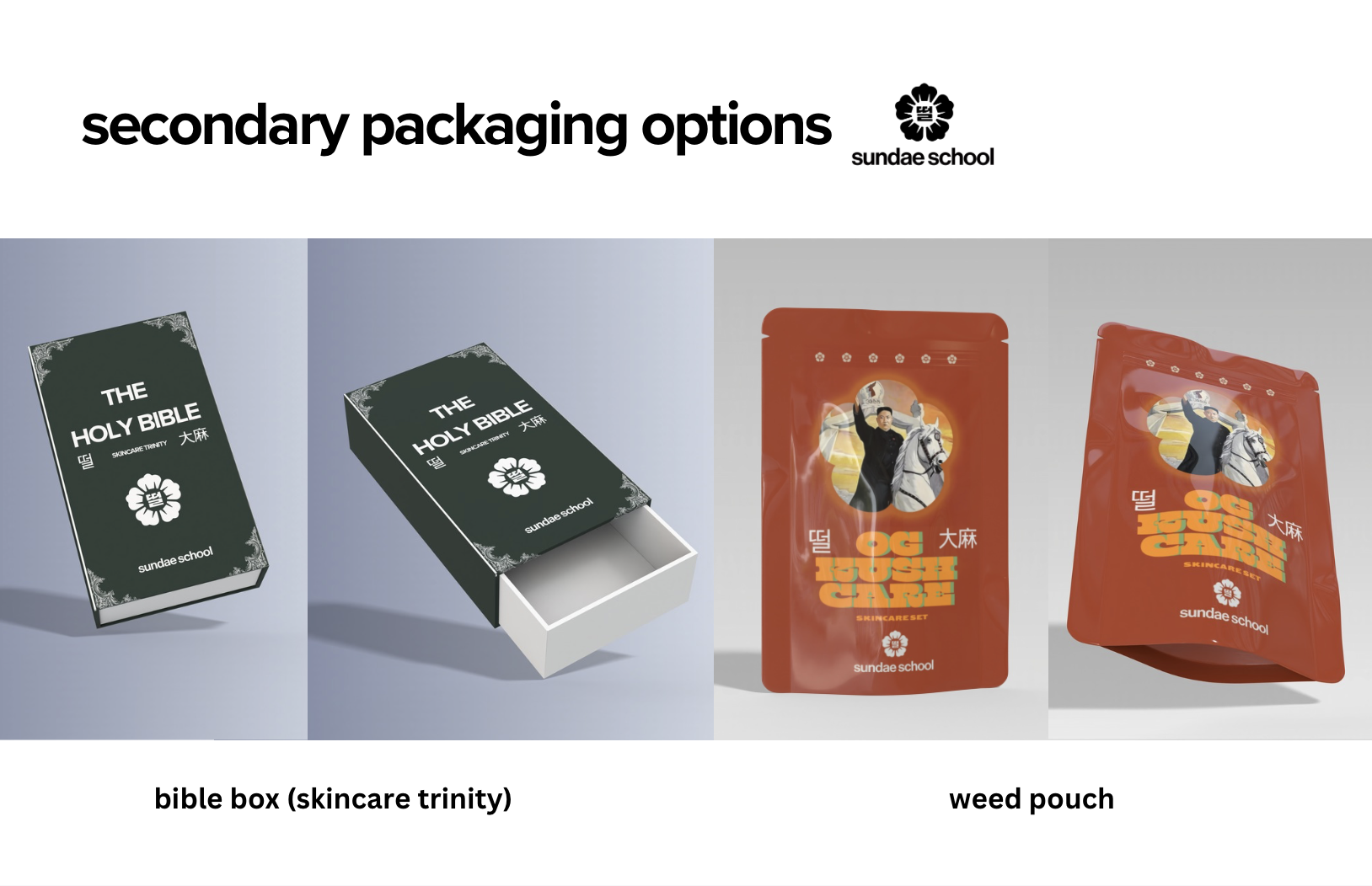
the primary packaging was intentionally kept simple and standard to support easier production, while the secondary and tertiary elements became a space to express the brand's personality through irreverent, religious-inspired naming and playful graphics that reflect sundae school’s witty and culture-blending identity.


exploration
I focused on making the product packaging cost-efficient and strategically optimized, based on market research and an understanding that sundae school is still a growing brand with diverse product lines. The packaging maintains the brand’s signature sleek and clean aesthetic, consistent with their existing cannabis offerings.
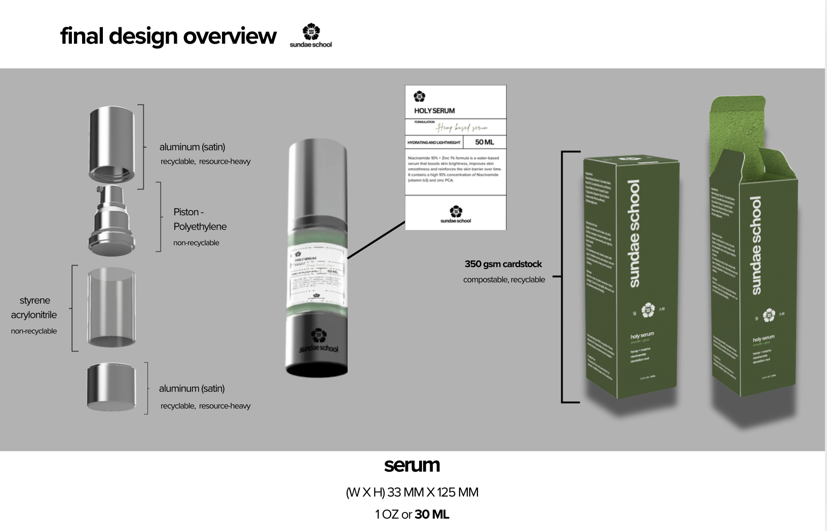
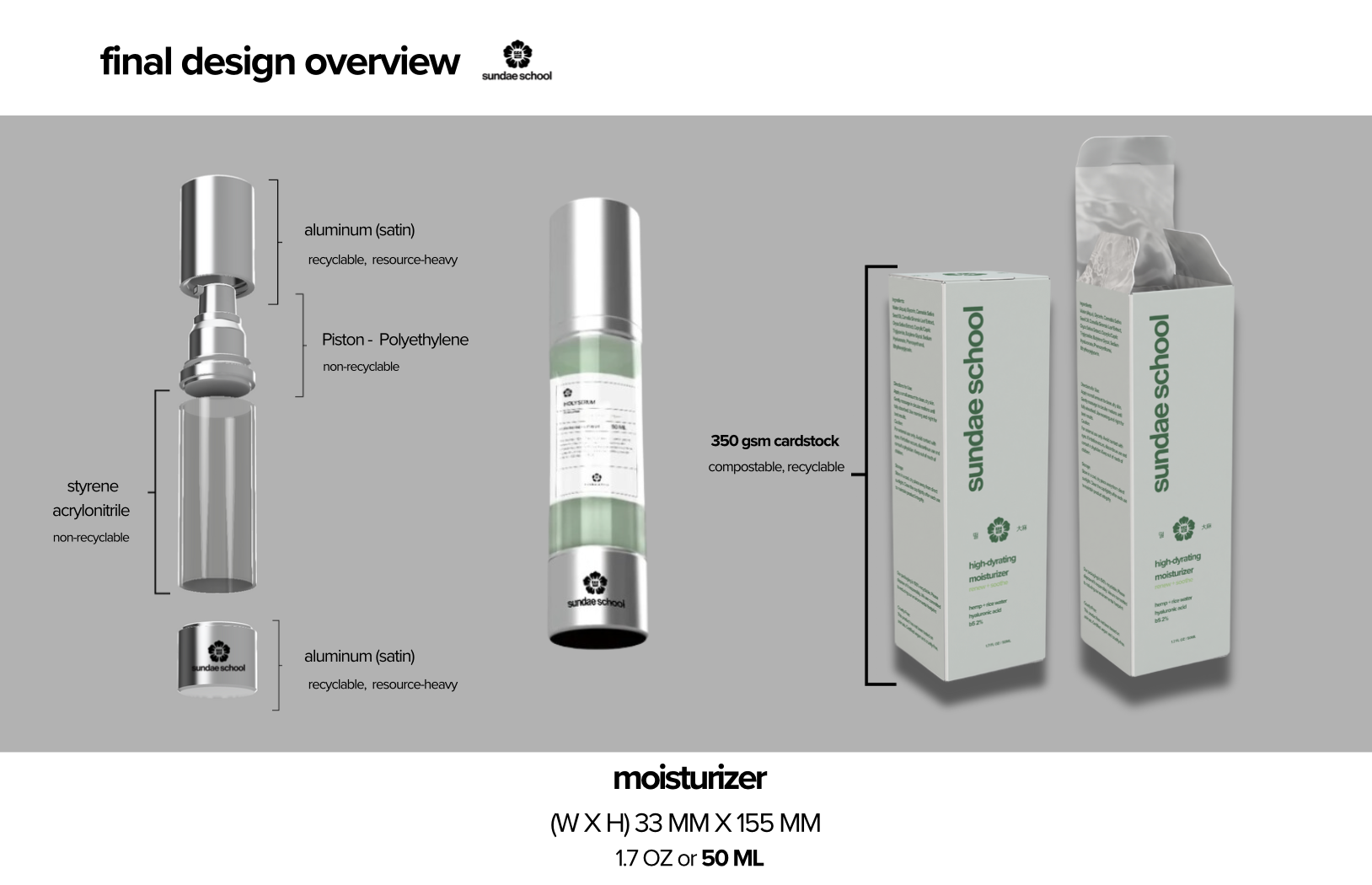

primary packaging was intentionally kept simple and standard to support easier production, while the secondary and tertiary elements became a space to express the brand's personality through irreverent, religious-inspired naming and playful graphics that reflect sundae school’s witty and culture-blending identity.


result